- View more resources from this publisher
 Colin Foster
Tooltip
These resources have been reviewed and selected by STEM Learning’s team of education specialists for factual accuracy and relevance to teaching STEM subjects in UK schools.
Presenting Data Graphically
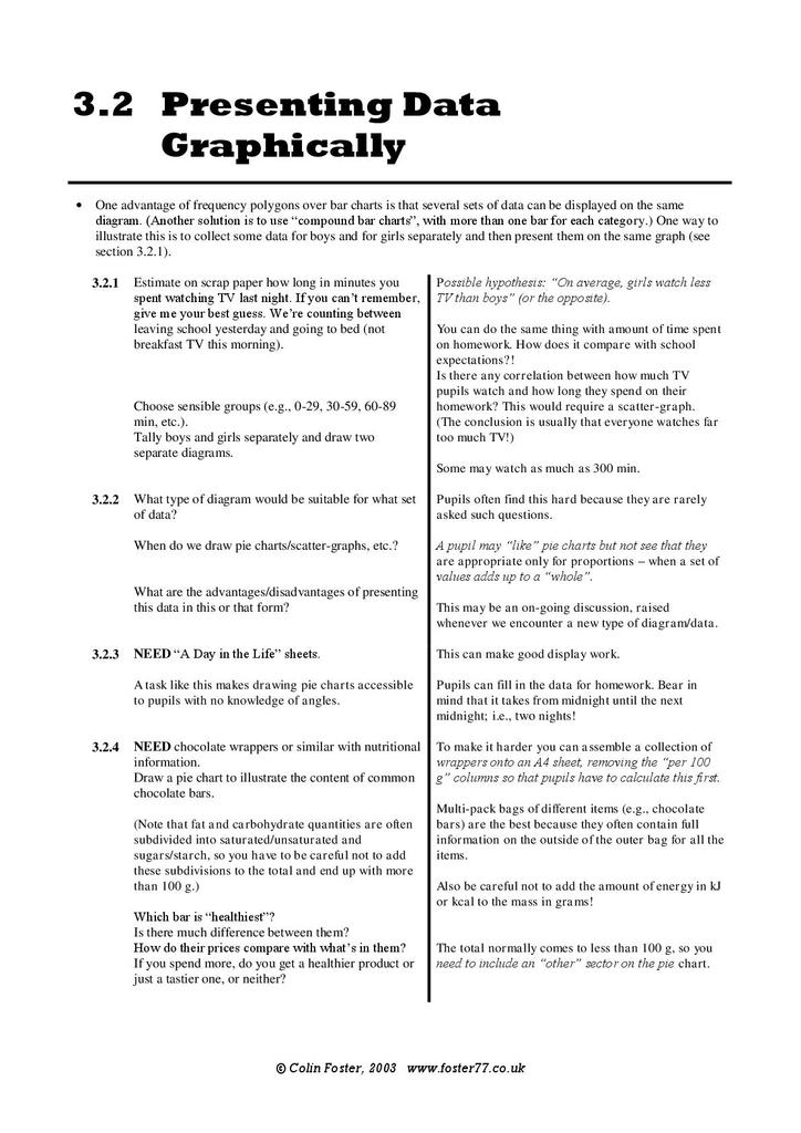
This resource contains four instant maths ideas exploring how to represent data graphically. In the first task students record how long they watch TV, group the results and draw two separate graphs to compare boys and girls. The second task requires students to consider what type of diagram is suitable to represent what kind of data. The third task asks students to draw a pie chart to represent a day in their life which the final task is more challenging, requiring students to draw a pie chart showing the ingredients of a chocolate bar. Student resource sheets explain the different types of correlation, a check list of things to consider when drawing bar charts, vertical line graphs, histograms, pie charts, cumulative frequency graphs and box and whisker graphs. The final resource sheet accompanies the third task and is designed to make pie charts accessible without a knowledge of angles.
Show health and safety information
Please be aware that resources have been published on the website in the form that they were originally supplied. This means that procedures reflect general practice and standards applicable at the time resources were produced and cannot be assumed to be acceptable today. Website users are fully responsible for ensuring that any activity, including practical work, which they carry out is in accordance with current regulations related to health and safety and that an appropriate risk assessment has been carried out.
Downloads
-
Presenting data graphically 299.12 KB
Show downloads
-
 Presenting data graphically 299.12 KB
Information on the permitted use of this resource is covered by the Category Three Content section in STEM Learning’s Terms and conditions.


